Homepage: Using Your Homepage

Getting Started
Your Measured Homepage is the first page you will see when you log in. It shows both your overall business metrics and your individual channels and tactics.
Additionally, it provides insights into optimizing your budget and your recent industry benchmarks, all of which can be used to improve your marketing performance.
Getting to Know the Layout
The Homepage is divided into a few main sections, as laid out below.
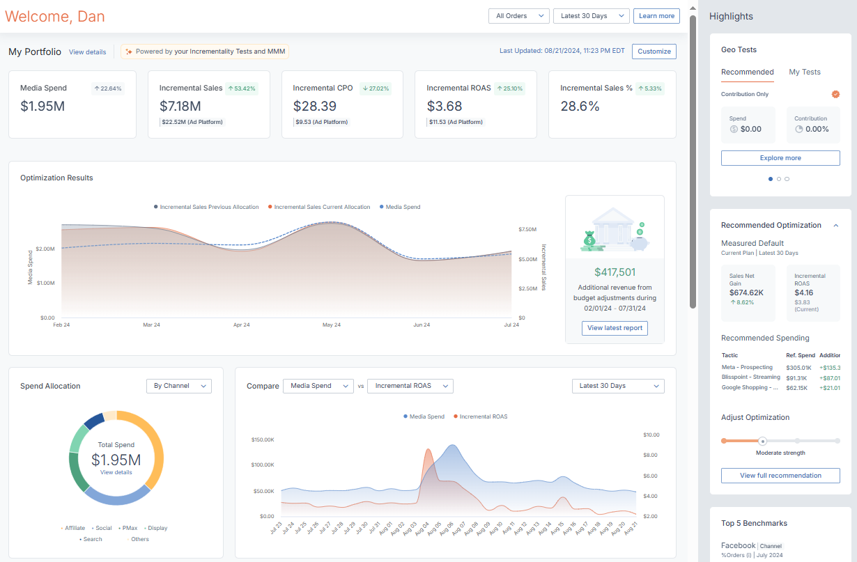
Global Filters
In the top-right corner of the Homepage’s main section, you’ll see options that will dictate which metrics display over the entire dashboard.
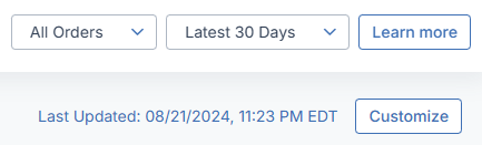
The two drop-down menus let you:
- Choose which of your conversion types should be reflected across the Homepage.
- Select a recent time period that your Homepage will show data for.
Additionally, this section will show you when your dashboard was last updated. For further information about when Measured processes your integrated data and when it is displayed, see our Data Refresh Policy.
The Customize Section
Clicking Customize will open a window giving you the following options:
- My Portfolio Metrics lets you decide which metrics will display in the My Portfolio section.
- Spending Visualizations lets you turn the data visualization charts on or off.
- Included Channels lets you select which of your channels you want to be aggregated into the data you see across your Homepage. These channels will also be shown as tiles in the My Channels section.
- Channel Tile Metrics lets your decide which metrics will be shown on the My Channel tiles
- Channel View Metrics lets you select which metrics will be available when you click on a My Channel tile.
My Portfolio
The first metrics you’ll see on your page represent the aggregated data from all of your channels (unless you have excluded them in the Edit Homepage menu). The data you see will also reflect the date range you have chosen.
For an in-depth view of the metrics you can see in this section, visit your Cross-Channel Dashboard by clicking Analyze from the top navigation bar, then Cross-Channel.
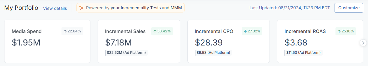
You can display any of the following, or choose not to see them via the Customize menu:
- Media Spend is the total amount you’ve spent on media for all of your selected channels
- Incremental ROAS is the incremental return on your total media spending
- Incremental Sales is the revenue that is directly driven by your total media spending
- Incremental Sales % is the portion of your revenue that is due to your total media spending
- Incremental CPO is the incremental cost of your individual orders
- Sales is your total sales revenue across all of your selected channels
- Orders is your total orders from all of your selected channels
- Incremental Orders % is the portion of your total orders that is due to your media spending
In the upper-right of any tile, you can see a percentage change showing how the metric compares to the previous time period.
In-Depth Metric View
Clicking on any tile in the My Portfolio section will open up a deeper view of that metric.
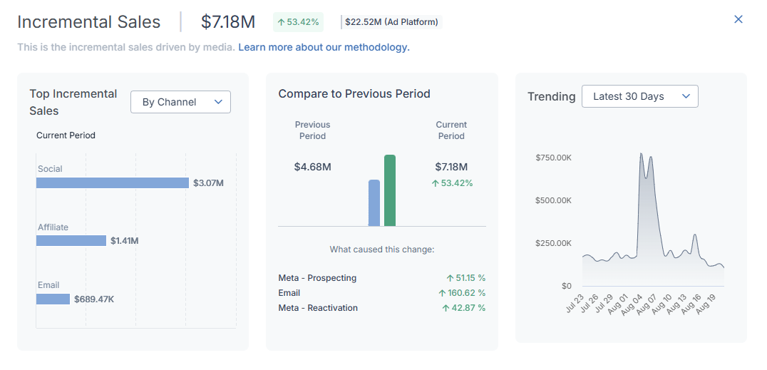
In this view, you can see:
- A chart displaying which of your channels or tactics were the biggest contributors to the chosen metric
- A comparison chart that lets you choose a date range to compare the metric’s performance against, complete with the tactics that impacted the change
- A trend chart that visually displays the metric over the date range you select
Optimization Results Chart
The first chart you can show is the Optimization Results chart, which ties into the Optimization Report by showing you the additional revenue you have made over time by adjusting your marketing budget.
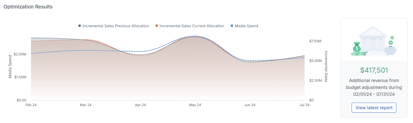
It shows a comparison between how a given period actually went versus how it would have gone if you had not made any budget adjustments during that period.
The difference between the actual and hypothetical scenarios becomes the additional revenue shown to the right of the chart.
Spend & Compare Charts
Next, there are two charts giving you visual breakdowns of your media spending over the selected date range.
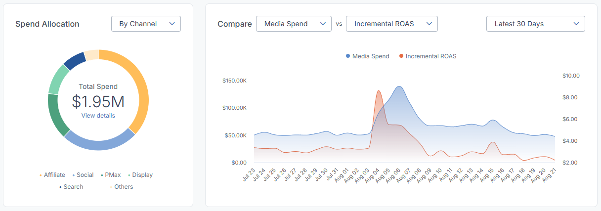
- The Spend Allocation chart shows the total spending on your selected channels as a circular graph. You can select to view the different sections as either your channels or ad platforms. In both cases, the legend below the chart will tell you what each colored section represents.
Hovering over a given section will also show what it represents, as well as showing precisely how much was spent alongside its incremental ROAS. - The Compare chart lets you choose two separate metrics to line up against each other, so you can see trends over time. You can also choose a separate date range to view that is independent of the period chosen for the rest of your Homepage data.
Moving your cursor along the chart will show precise data about the point in time you’re highlighting.
My Customers
The My Customers section provides insights into your customer growth. It contains two charts which display customer acquisition cost (CAC) and lifetime value (LTV) data. Seeing these metrics over time will help you develop your customer acquisition strategy.
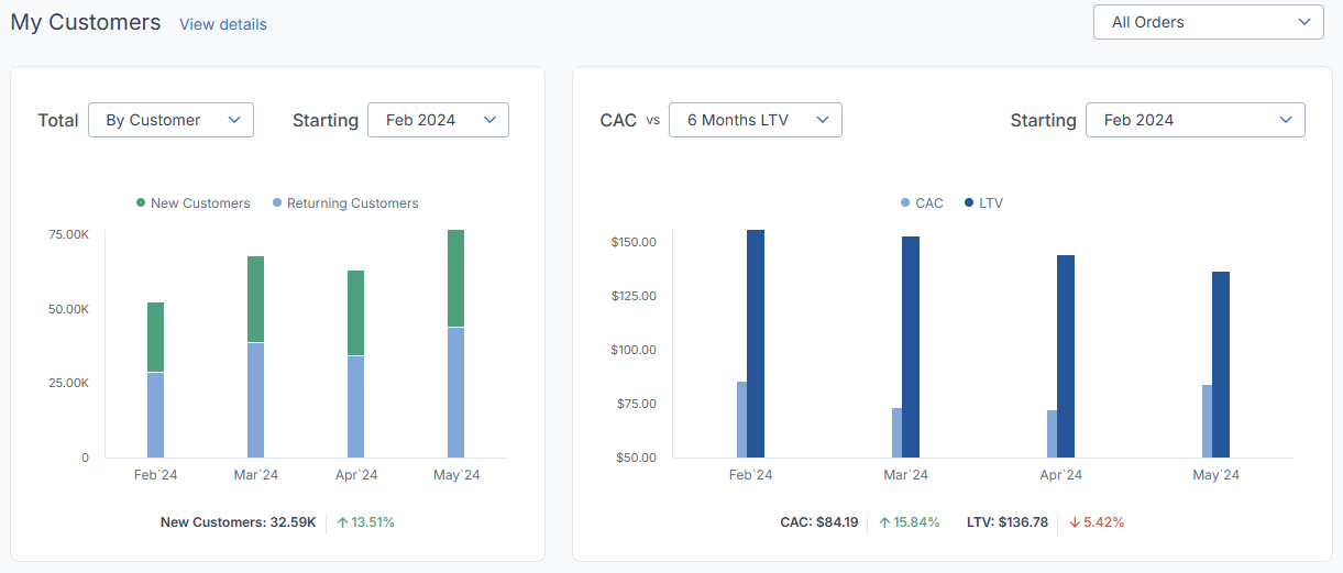
- These are shown on a month-by-month basis, going back as far as the past two years. They are based on your transaction data and uses a field such as Customer ID to identify the orders from new vs. existing customers for any period.
- First is the New vs. Returning Customers chart. It shows you a breakdown of sales between your new and existing customers by month. You can switch between viewing this by number of customers or by the revenue they have generated. Use this data to study seasonality trends between the two groups, or to make sure you’re hitting your acquisition targets.
- Next is the CAC vs. LTV chart. It shows the average cost of acquiring a customer in a month versus the average revenue generated by those customers. You can choose different LTV time periods for measuring revenue. The ideal ratio between CAC and LTV is unique to each business, and this chart will help you view it over time to determine future planning.
- In these charts, new customer revenue or orders are attributed to the first month in which the customer took action. Customer activity from any period prior to that month will categorize them as an existing customer. Lifetime value (LTV) is defined as the average revenue per customer over the length of your chosen LTV value, based on the month in which you acquired those customers.
My Channels
At the bottom of the Homepage’s main section, you’ll see all of the channels that you have selected for display. They will be arranged as individual tiles.
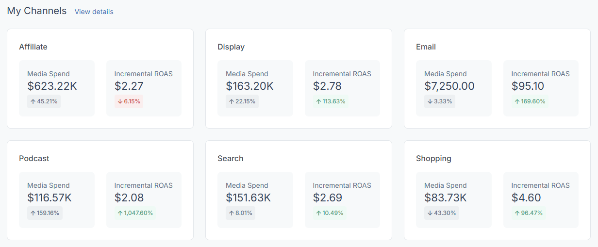
For each of these tiles, you’ll get a summary view of the channel’s spend and incremental ROAS over your chosen date range. You'll also see a percentage indicating the metric's change since the previous period.
Note that you can access your Cross-Channel Dashboard via the link to the upper-right of this section, which will provide an alternate view of this information.
In-Depth Channel View
Similarly to the My Portfolio section, clicking on the tile for a given channel will open a deeper view of that channel’s activity.
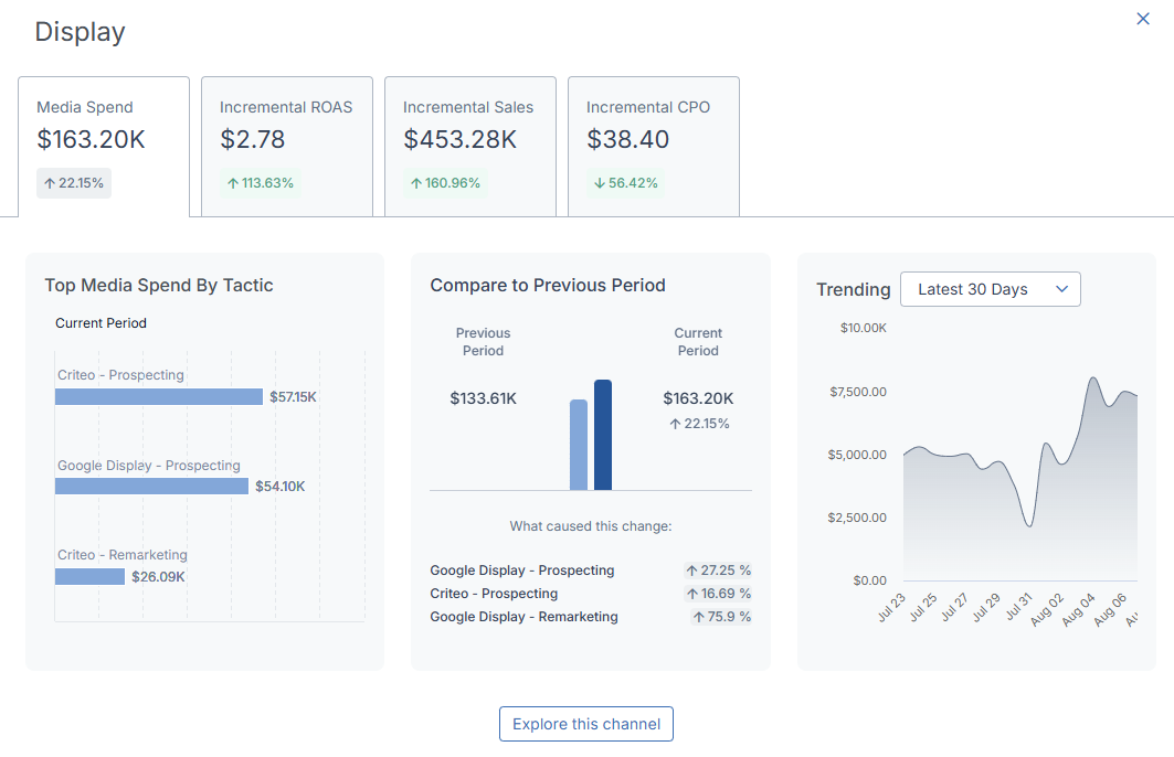
This window contains the same diagrams as the In-Depth Metric View from the My Portfolio section, with the key difference being that you can use the tabs at the top of the window to focus on a specific metric related to the channel.
Clicking Explore this channel at the bottom of the window will take you to your Cross-Channel Dashboard, where you can further explore the channel’s activity.
Highlights Sidebar
To the right of the Homepage, you’ll see various sections linking the data across your dashboard to other useful Measured features. Each section contains a direct link to its corresponding feature page on the Measured platform.
- Recommended Optimization shows the results of a potential Media Plan Optimizer plan that has been calibrated to increase the returns of your spending. Clicking the section will expand it to show which tactics will be impacted, the optimization strength
- Geo Tests shows test opportunities that Measured recommends based off your data, which you can easily launch from the Geo Tests page. You can also get a top-level view of the status of all of your tests that are currently in progress.
- Top 5 Benchmarks shows your recent industry benchmarks. For the metric specified at the top of the section, you will see where you stand next to a separate number for the industry benchmark. Below, this information will be laid out visually. You can cycle through your benchmarks via the carousel buttons at the bottom of the section.
Beyond those sections, you’ll also see information for any tests that you are currently running under My Brand’s Tests. This section will show the current status of your test(s), and clicking a test here will expand to show a link to more information, like the test’s dates and execution details.